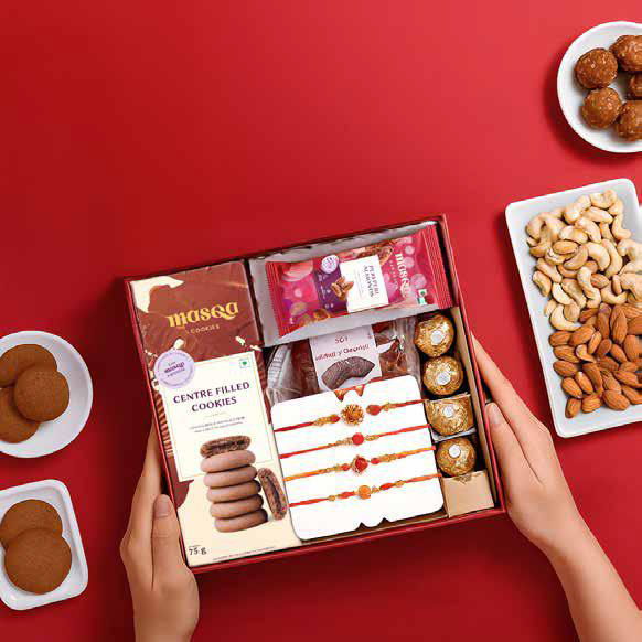
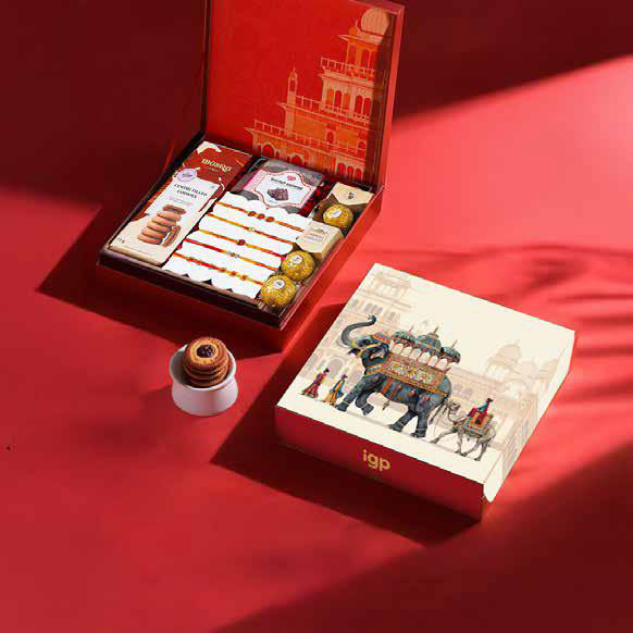
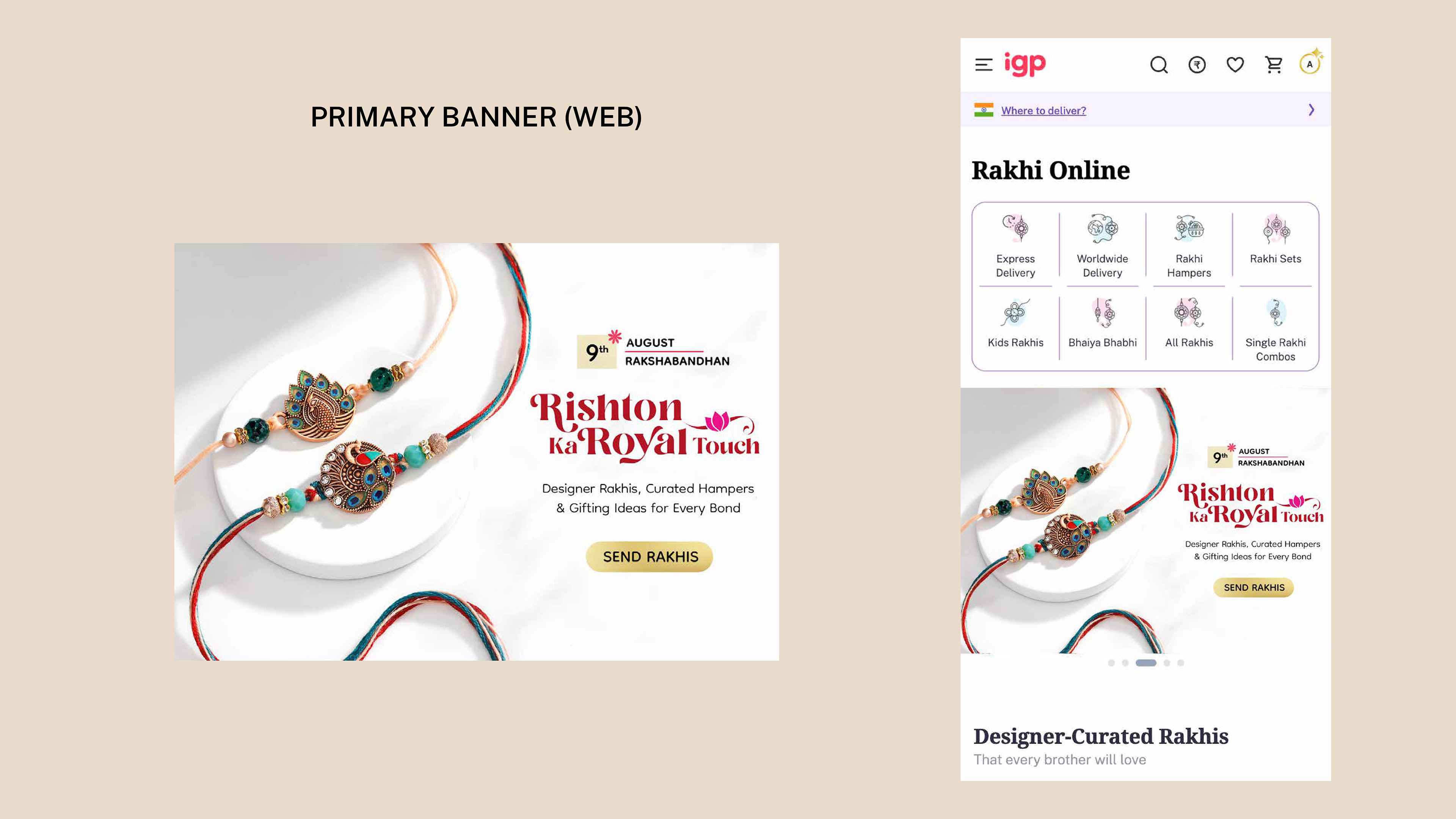
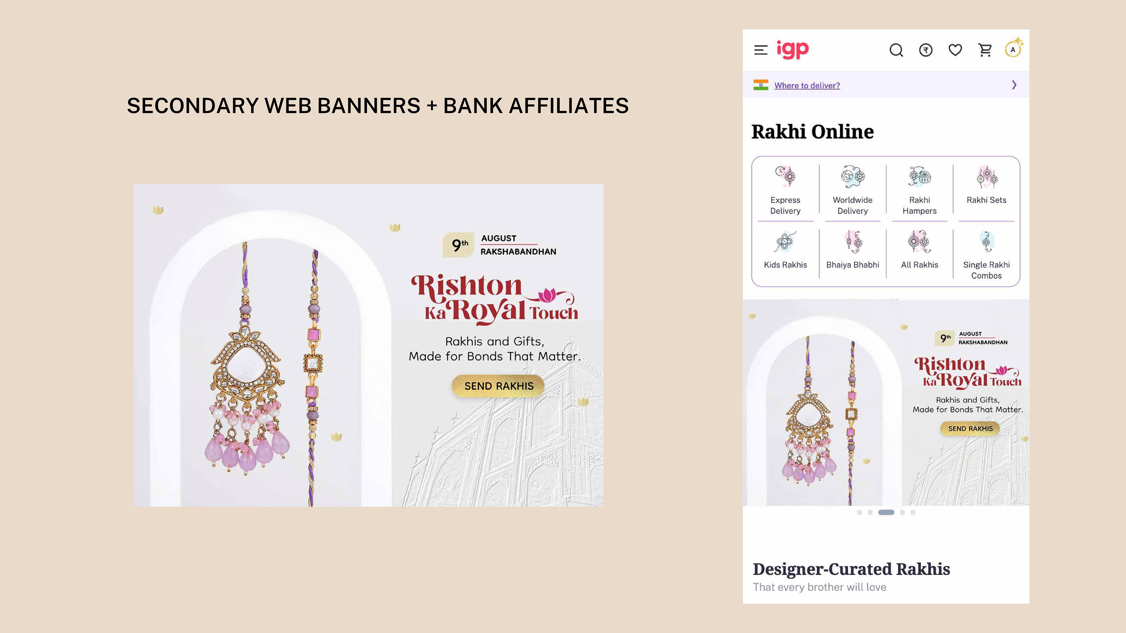
Rishton Ka Royal Touch
IGP Rakhi 2025 | Campaign & Photoshoot Direction

The campaign was built around the thought: “Rishton Ka Royal Touch”
positioning Rakhi as a gesture that elevates relationships, not just celebrates them.
The objective was to move beyond transactional gifting and create a visual language that feels premium,
emotional, and occasion-worthy, while still performing across high-frequency digital touchpoints.
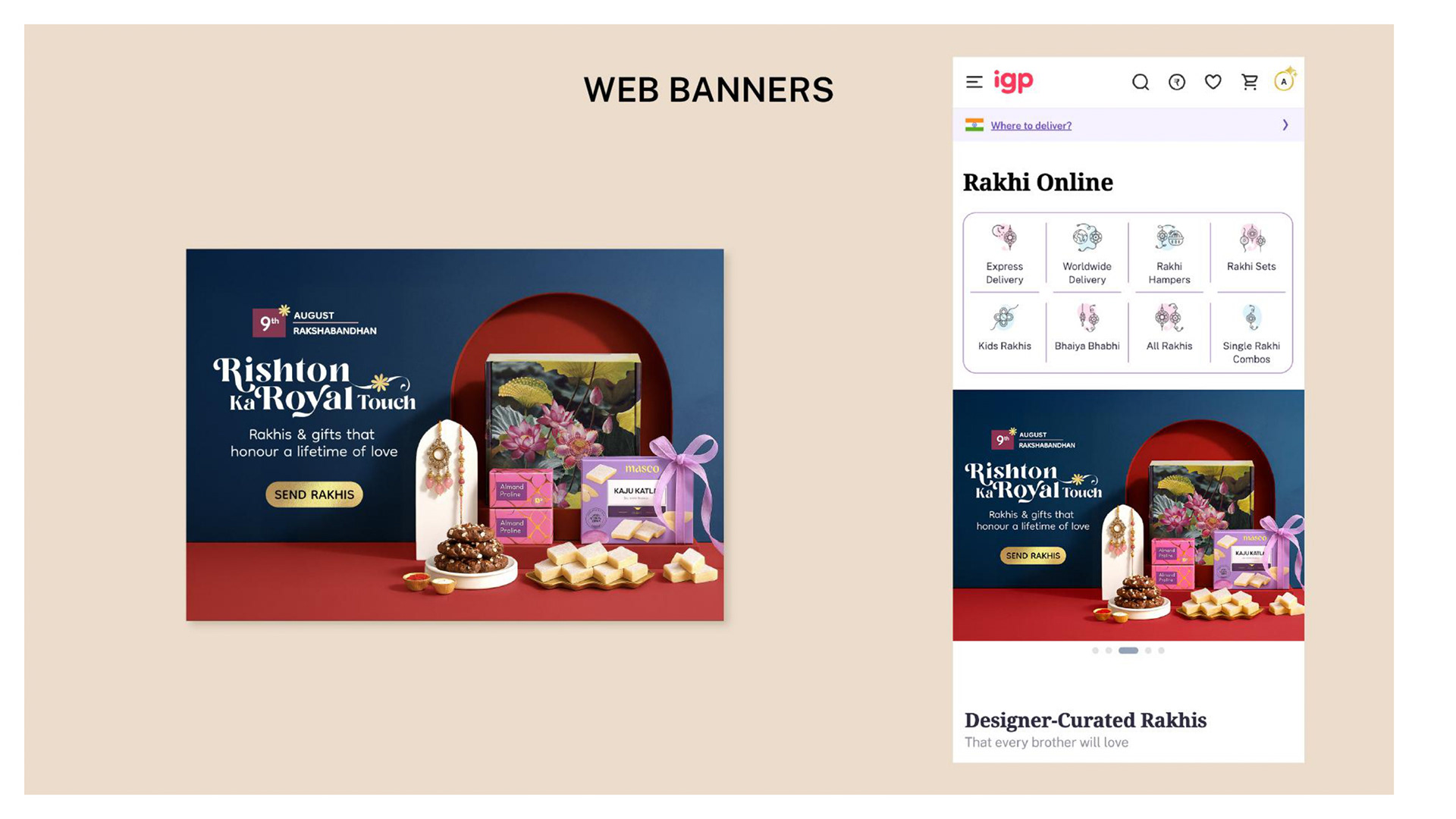
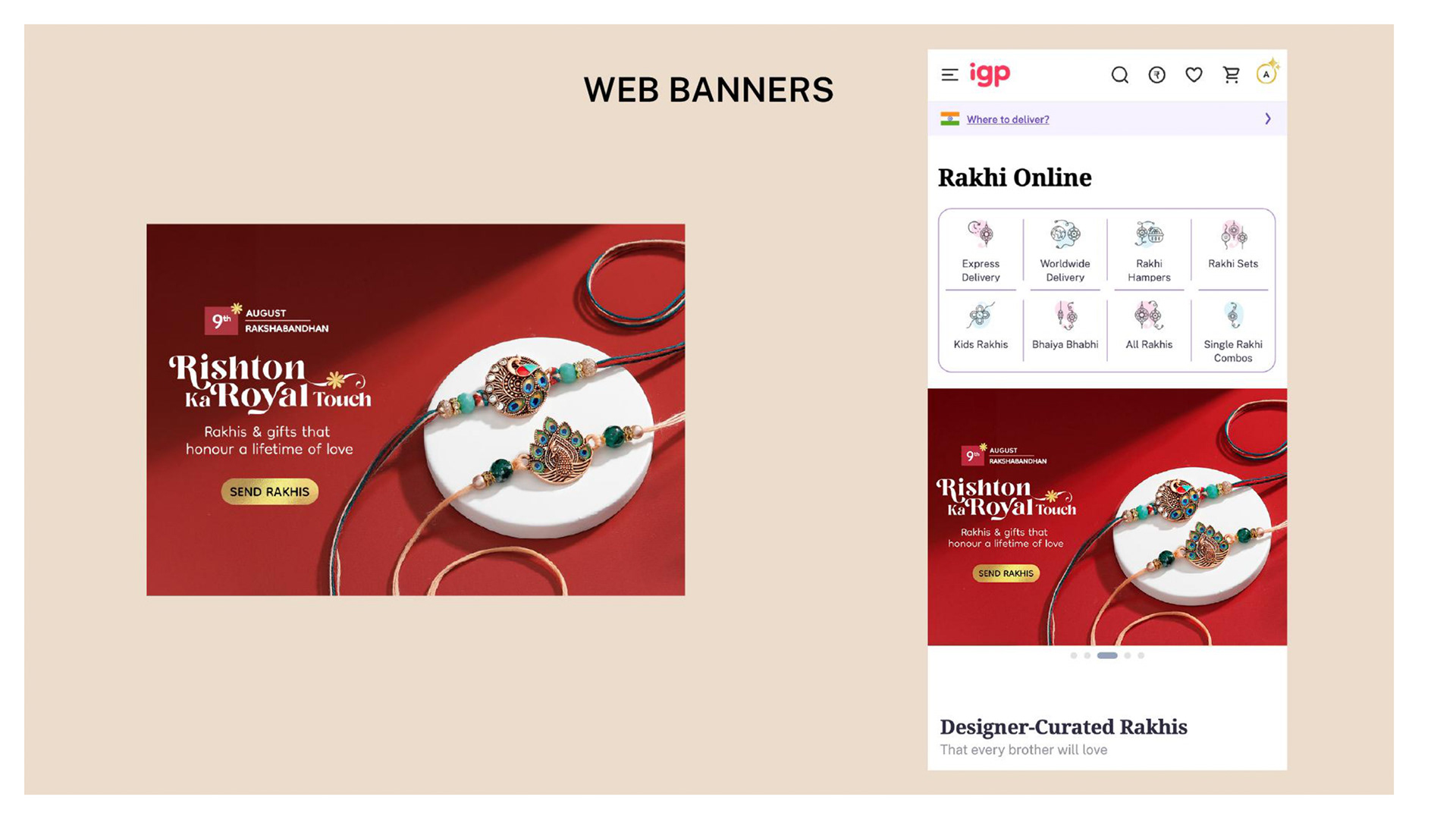
Creative Direction | Photoshoot
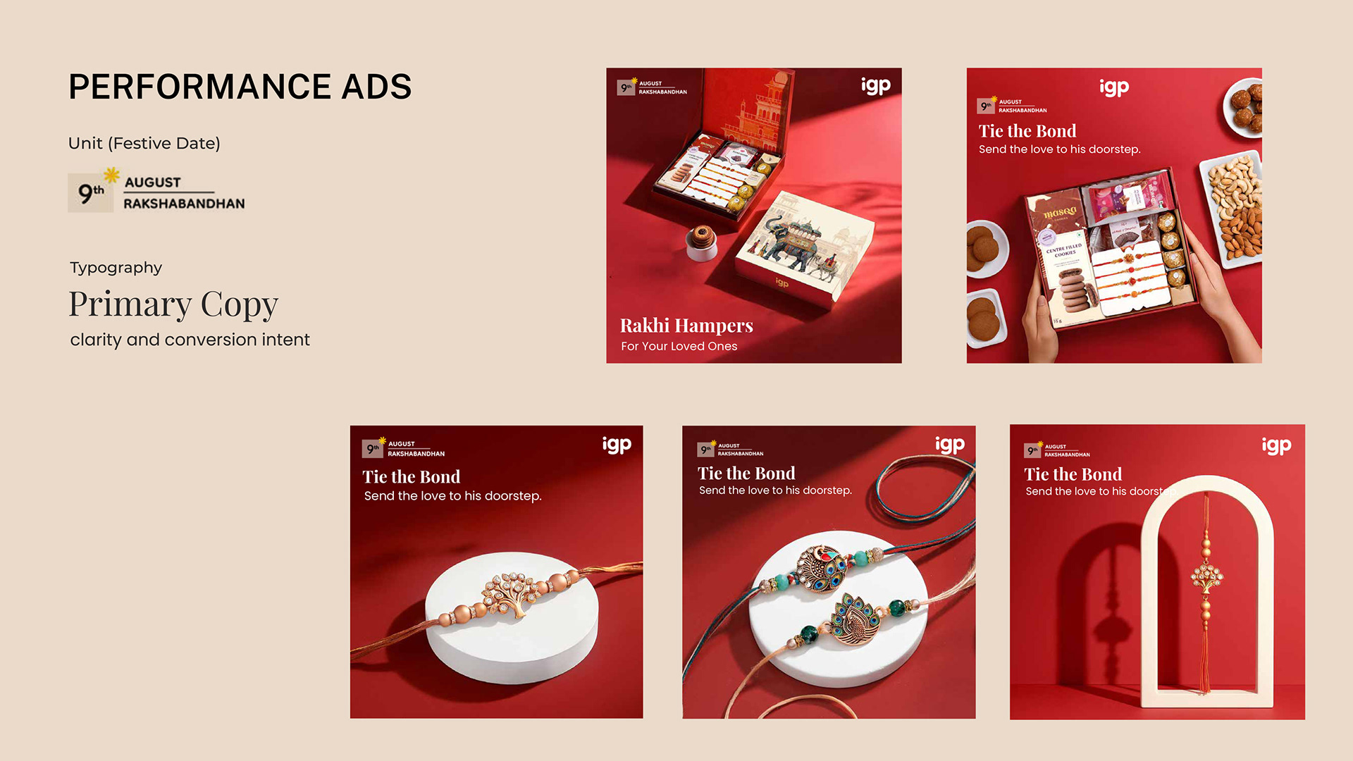
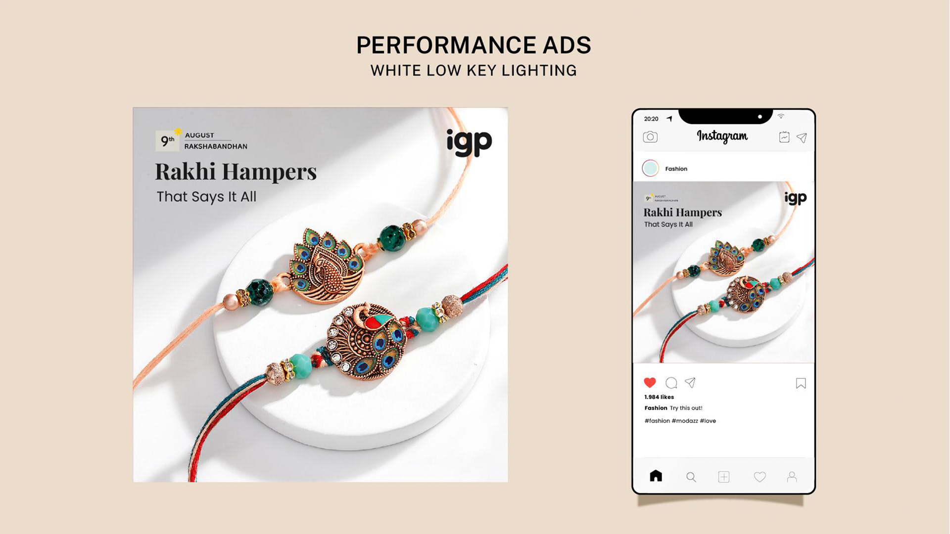
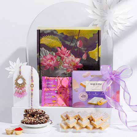
Two distinct visual environments were created to serve different parts of the funnel:
Two distinct visual environments were created to serve different parts of the funnel:
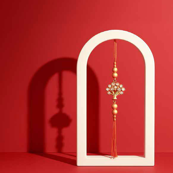
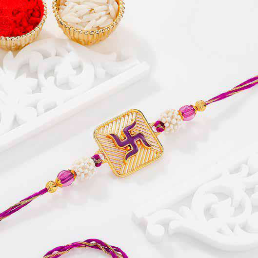
1. Clean White High-Key
Used for clarity, elegance, and detailed product exploration.
Soft lighting and minimal backgrounds allowed the craftsmanship of the rakhi to stand out.
Soft lighting and minimal backgrounds allowed the craftsmanship of the rakhi to stand out.
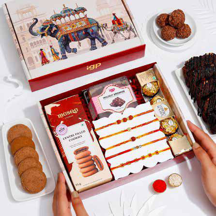
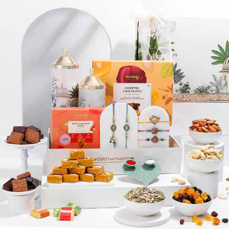
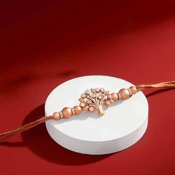
2. High-Contrast Festive Red
Used for attention, urgency, and scroll-stopping impact.
Strong shadows, bold compositions, and centered product focus ensured high visibility in performance ads.
Strong shadows, bold compositions, and centered product focus ensured high visibility in performance ads.
This setup prioritizes conversion; clear product visibility, strong CTAs, and minimal distraction.